I’m brand new to the Alpha so forgive me if this is already covered or not relevant.
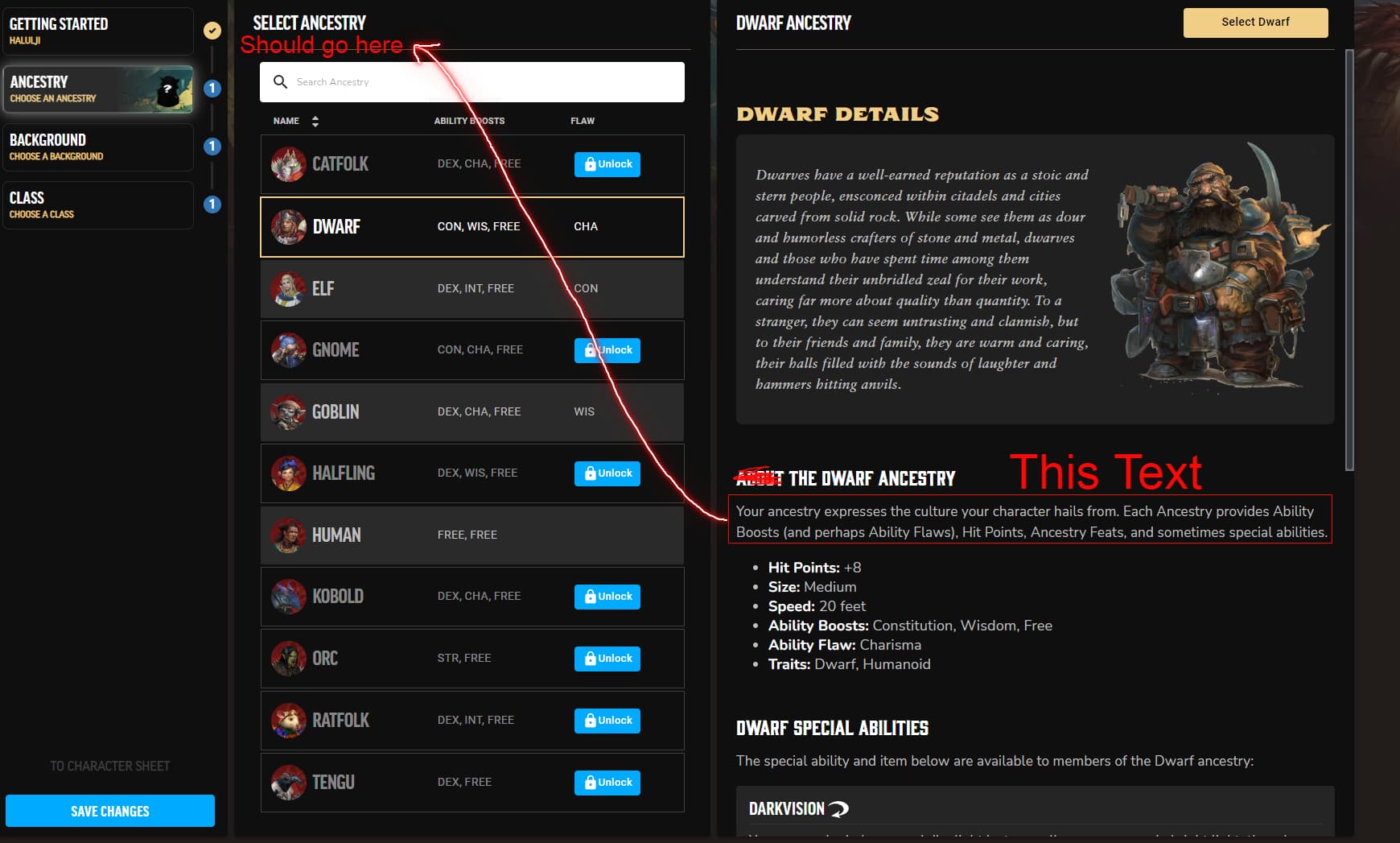
My first impression is ‘ya, this is gonna be super useful’ and I can imagine myself losing hours just building characters. But when I got to the ancestry selection something felt out of place and disrupted the flow from a visual aesthetic. I have included a screenshot of the dwarf page with annotation to depict what I am about to write, but this applies to all ancestry pages.
-
the section titled “ABOUT THE DWARF ANCESTRY” isn’t actually about the dwarf ancestry. It is simply the generic text of what an ancestry is while the actual meat of what a dwarf is is already covered in the Dwarf Details section. This is replicated on every ancestry page.
-
the ancestry text highlighted in the above image would be better located just under the Select Ancestry title so that it is in a static location, always visible to remind the player, and does not need to be duplicated on every sub-page where it provides no additional value.
-
with that text moved you can also delete the ‘ABOUT’ text from the title line. so it would just be ‘THE DWARF ANCESTRY’ or ‘THE KOBLOD ANCESTRY’, giving the section a little more punch and helping with the player’s immersion in the character build.
Thank you for your time