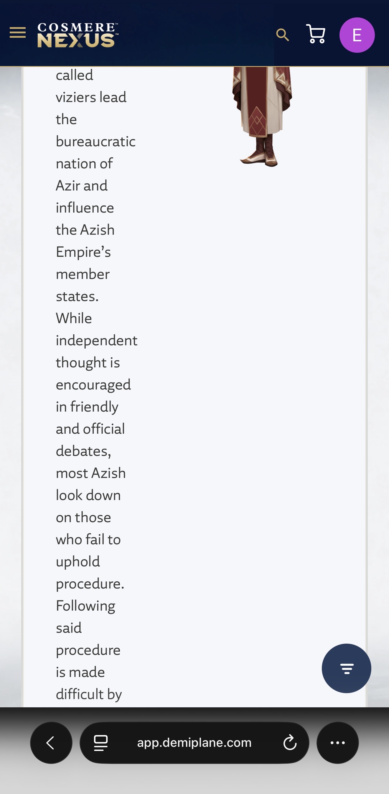
Not entirely sure how I should word this but the mobile display can be very difficult to use. An example of what it looks like when reviewing Cultures is that the words are piled up on one side and the other side has all this dead space. Hopefully my picture uploads but if not, I’ll edit the post with an image hoster link
Thanks for the report. I’ll pass this along so we can take a closer look at those pages.
1 Like