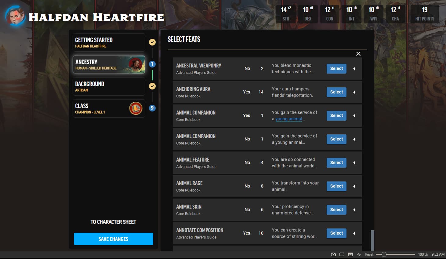
Firstly, the character manager looks fantastic. I love that all the skills are expandable to show each relevant skill action, and that every feat and feature can be clicked for more detail. The load times are killer, but it’s still early in the lifecycle, so I have faith that that’ll be addressed as the the service is prepared for launch. One of the major issues I have with the tool so far–and I haven’t tried using the character builder on anything other than Firefox so it may not be an issue elsewhere–is that it seems like the character builder itself is fixed to the height of the background image of the page, which if it isn’t zoomed out a bit cuts off the bottom few rows of interactable elements. Depending on the size of monitor you have it makes the text a bit hard to read if you have to shrink things down to 70% just to get all the options on the screen. If the manager itself could be separated from the background elements I think it’d go a long way toward accessibility. ![]()
Thanks so much for the feedback! I can reproduce this on my end as well, and I’ve passed it on to the team.
I believe I’ve read that the desktop version is the priority and mobile will be worked on after, but I’ve just encountered the same issue on mobile. The initial disclaimer can’t be scrolled on because of the fixed position and the resolution can’t be changed, making the actual character editor unusuable by phone.
On that note, I understand the disclaimer is important to let people know how the alpha is being handled, but once your account registers having agreed to it, can it not appear on subsequent attempts to use the builder? Aside from blocking mobile access to the tools, it just adds a step to starting character creation and is generally annoying to have pop up every time I want to make or especially edit a character.
One of the major issues I have with the tool so far–and I haven’t tried using the character builder on anything other than Firefox so it may not be an issue elsewhere–is that it seems like the character builder itself is fixed to the height of the background image of the page, which if it isn’t zoomed out a bit cuts off the bottom few rows of interactable elements.
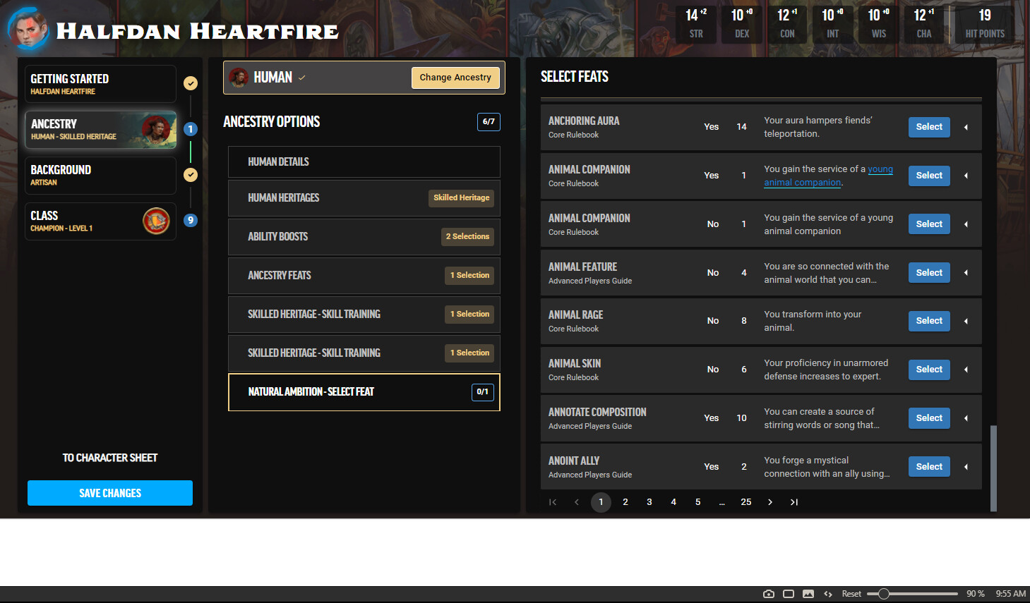
I don’t think this is just a Firefox issue, as I was seeing this same issue in Vivaldi. I can also confirm that zooming out to 90% not only fixes the missing elements, it also allows the descriptor box to move to the side, which is a much better experience that I like a lot! Here are screenshots for reference.
Zoom at 100% in Vivaldi (cannot scroll down past the point seen):
Zoom at 90% in Vivaldi (white space is rendered):
This is correct - we have not touched anything with mobile views yet, so we expect that there will be several issues that would make those views more or less unusable. Another way to put it would be that if anything actually works on mobile at this point, it would only be a happy accident and not any kind of intentional polish.
Yes, the intention is to get the alpha acknowledgment once and remember that for your account, but we haven’t gotten there yet. It’s on the list, but we’re still in very early days.
In addition to not touching mobile yet, we also have not put any work into ensuring the cross browser experience, zooming, etc. Basically, if it is not in Chrome on a standard desktop size, we are fully aware that many issues will arise (and honestly, we are so early in the process at this stage we also understand that there are several things that still need to be polished even in that standard environment).
We appreciate the feedback - we will log it and take a look when the time comes for us to put focus on mobile and other views. Thanks!
Thank you, BadEye!
Now that I am in the actual character sheet, I really like the layout. Even in the alpha stage, it is laid out and behaves much more intuitively than Herolab Online, which is what my group is currently using for a digital charsheet. The dice roller in particular behaves much more nicely.
Bravo to your team on the progress so far!