Can we please get a clearer font or use wider spacing for text on the Daggerheart character builder?
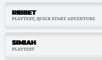
As someone with poor vision, the font used for bold headings (like the one used on the heritages) is far too difficult to read for me.
Simiah and Ribbet are prime examples, the letters are too close together so part of the words just becomes a black smudge for my poor eyes as one letter bleeds into another… I have to zoom in to around 160% on my browser before it becomes legible.
The formatting of the text used on your Pathfinder character builder is much clearer and easier on the eyes.
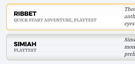
Yeah, what’s in your screenshot isn’t how that font typically renders in Chrome:
I imagine you’re using another browser that is applying a bold on top of a font that’s already bolded. I checked Firefox (since that one is known to do that), but couldn’t reproduce the issue.
Can you share which browser / operating system you’re using? I’m sure we can provide a fix to make the text act like it should in after we take a look.
I am using Firefox 123.0.1 (64-bit) on Windows 11 Home 23H2 (OS Build 22631.3296).
No active extensions running.
I’ve just installed Chrome to check and it does appear to look better in that browser.
Strangely, on Firefox, the hard to read bold font only appears to be occuring with the Daggerheart character sheet. All the other game systems look absolutely fine and display the same as they do on Chrome.