Hello!
We are using the PF2e character sheet for our party, using new characters created in the last couple weeks. We’re all using mobile devices. There are a few issues we’ve been having:
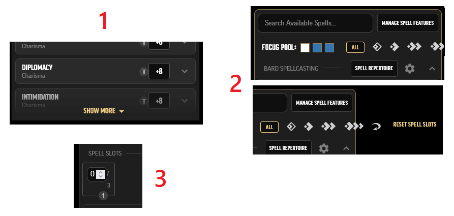
- Minor annoyance: needing to click “Show more” to use any skills other than the top few
We frequently make stealth and lore checks, and every time it requires us to navigate to the skills tab, click “show more”, and wait for the animation to finish. Having to do this 10-15 times a session can get tedious.
- Display issue: horizontal overflow in spell list
These elements overflow horizontally and spill off the page to the right.
- UX difficulty: spell slot field is super small and finnicky
The tiny text field is very difficult to edit on mobile (particularly in browsers where the HTML number input arrows don’t show up, but even when they do as they’re so small), and the layout/wrapping also seems off.
Thanks in advance for taking a look!