Hi,
The text spacing in the filter list is a bit ambiguous - the header for each filter is closer to the previous filter than the one it represents:
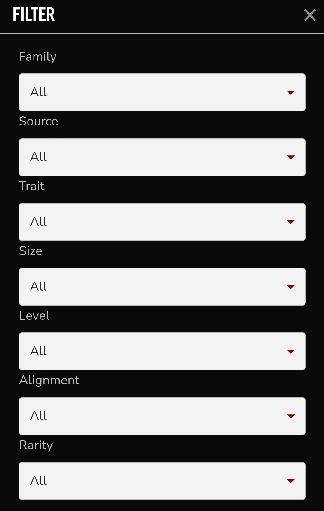
Even after using the filters multiple times, I’m still sometimes uncertain whether I should click above or below a header to get the right filter, most often getting it wrong on the first try. This is especially relevant on mobile devices where you can’t always see the very top filter and use that to seduce the correct ordering