Since I’m a new user, I can’t embed multiple images (I kinda understand why, but that’ll make this feedback look weird.)
Experience with PF2e: I’ve been playing PF2e for a little over a year now. I’ve been GMing a homebrew for a bit, as well as ran through an Adventure. I’ve also become the VA for an area for Pathfinder Society.
Some things I’ve noticed:
+ Great layout - I love that the default is taking the ABCs approach. Almost prompted for each item on what to do next. Everything feels fairly intuitive
+ Great graphics - In comparison to things like Pathbuilder and Wanderer’s Guide, I feel that this tool is leading by far as the visual style goes. Nice thematic fonts as well as color choices to make everything pop.
+ In character creation, I like the positive feedback that the creator is finished with a specific step.
+ In character creation, I think it’s great that the tool utilizes hover over for key words/mechanics
+ Character layout is nice and compact, leagues better than the default character sheet
+ I also enjoy the use of switching between Skills & Actions, Equipment, Spells, etc…
+ Filtering is good for where it is implemented
+ In character sheet, I absolutely love that you can expand each skill, and it shows a list of actions associated with each skill
---
? Looking forward to all the things yet to be implemented!
? In character sheet, I’m not sure what the intent is later on Spells, but I like the ability to jump straight to all the spells in the game. However, for character management, it might be best to limit characters to that which they’re able to cast.
---
- In comparison to Wanderer’s Guide, the labling of key terms/ mechanics is slightly lacking. If I were completely new to TTRPGs in general, it’d be helpful to have more
- In character creation, it is possible to select feats that are not appropriate for level
- In character creation, it would be objectively better to hide feats that are not appropriate for level
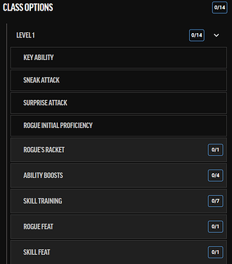
- One of these 14s seems redundant. I would change it so that there’s a notification that ‘Things need to be picked!’ or something of that nature, like an exclamation point.
— Image A here —
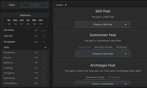
- For handling the skills, since they’re such an integral part of the game, it’d be nice to see what skills are at during each step of the progression. In Wanderer’s Guide, they achieve this by having a selectable dropdown, that then lists the total bonus each skill gets. I would suggest implementing something similar to this:
— Image B here —
- In the character sheet, it looks like the initiative button just does the default of Perception. It should instead allow for the player to select which skill they are rolling for initiative.
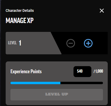
- In the character sheet, for managing XP, even if this is minor math, allow for players to enter how much XP they just gained instead of having them calculate out what the new total should be.

If I was told I just got 130 XP, it’d be a lot easier to just enter 130 than having to calculate out 670.
- In character sheet, this character has the background of ‘Miner’, which allows them ‘Terrain Expertise’.
— Image C here —
This is a skill feat. However, I feel like it should also be listed under the Background list. At least the way this is laid out right now, this makes it seem like there’s not any Background feat being applied.
— Image D here —
- In the character sheet, there should be an easy to locate button to edit the sheet/ take me back to character creation steps
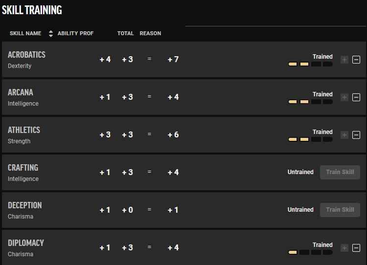
BUG: I’m not quite sure what the point of this minus button is in skill selections:
— Image E —
But when you click it, you are able to ‘boost’ another trained skill to expert or even into master at first level. This shouldn’t be achievable.


