So while I am excited to dive into this alpha properly, there’s a glaring issue that needs to be pointed out.
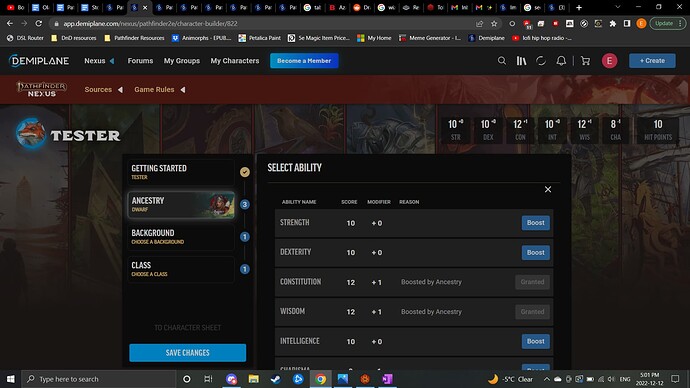
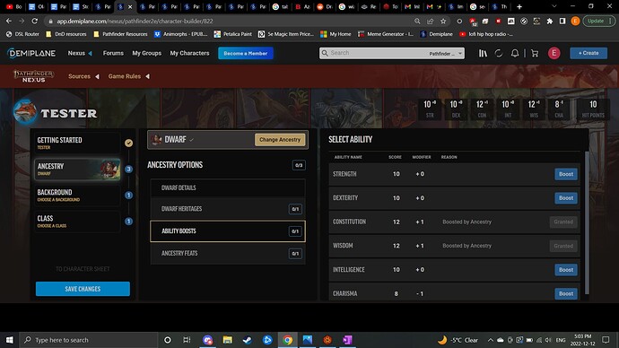
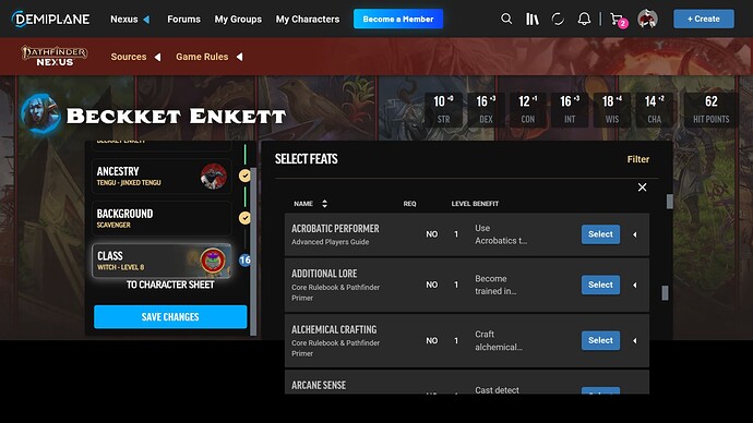
I am on my laptop which does not have a small screen, but the site is near unusable unless I change my zoom from 100% to 90%. In 100% zoom the bottom of menus are cut off, you only have the character overview and information panes while missing the options pane, and the entire site feels pushed to the bottom from the Demiplane toolbar, the Pathfinder Nexus toolbar, and then the blank space before the menu items begin. At 90% zoom the site can still feel generally pushed down but you have all 3 panes viewable and nothing is cut off at the bottom.
The character sheet itself suffers the same issue, requiring zooming out to 90% otherwise elements are cut off at the bottom of the page. I like the overall layout of the sheet, but it feels jarring to dedicate such a large part to an image of armour? Speaking of, I wanted to add armour and change it to see if it changed that image so I searched “rogue” in the add item search bar to see if I could find the rogue starter pack, but there was only one result, which was blank, and still had the “add item” button, which added nothing.
I’m looking forward to where this sheet goes when it is complete!


