Viewed on a modern iPad.
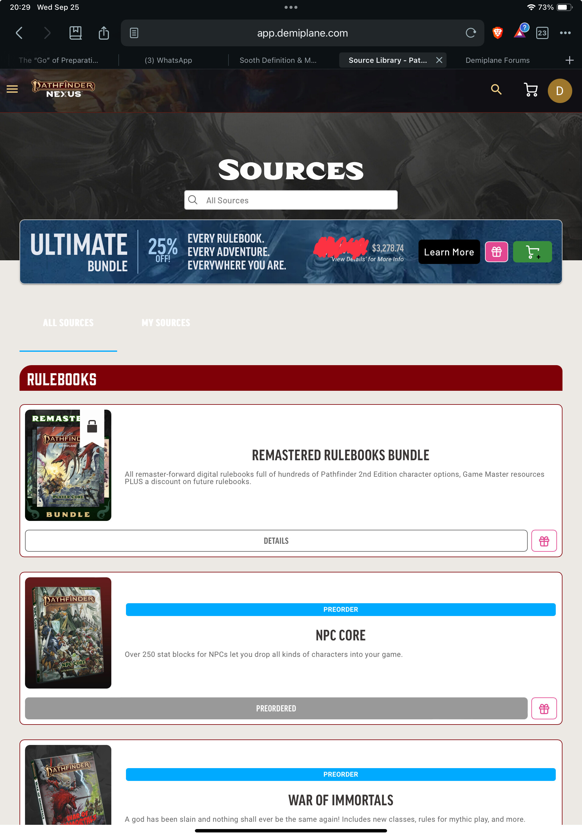
In portrait layout,
- why one book per row… this could easily be 3 per row
- why is there none of my content I actually want on the first screen… the few slots that are shown because of having one book per row are filled with “dead links”. I already own the remastered bundle and have preordered the npc core and war of immortals.
- the top background ends leaving the tabs for all sources or my sources unreadable.
- why can’t I pin books I’m actively using or even chapters or sections or useful tables here
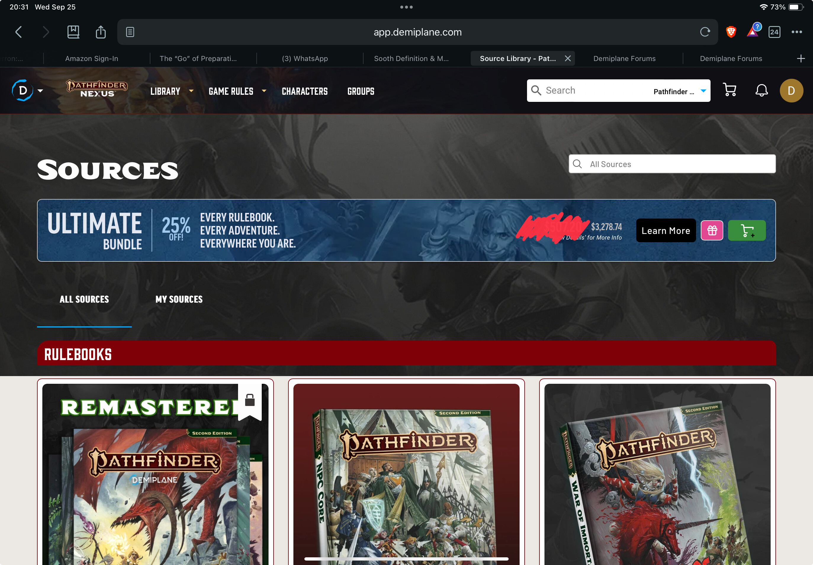
In landscape layout
- none of the content I want is here (see above) … maybe this could fit a 5 across view?
- at least here the all sources and my sources tabs are visible.
This is not particularly good user experience. It doesn’t feel like anyone tested this from a user perspective.
Thank you for all the work you do on making this a great place to play ttrpgs.