Hi, just various small things I noticed and had suggestions on. I’m an Android User , using the Firefox Browser on a Google Pixel 6 for reference.
The UI in general tends to have a “cramped” feeling. I’m not 100% sure why this is, but I suspect it’s due to each element being too big on its own, with large margins and text.
Using this screen as an example:
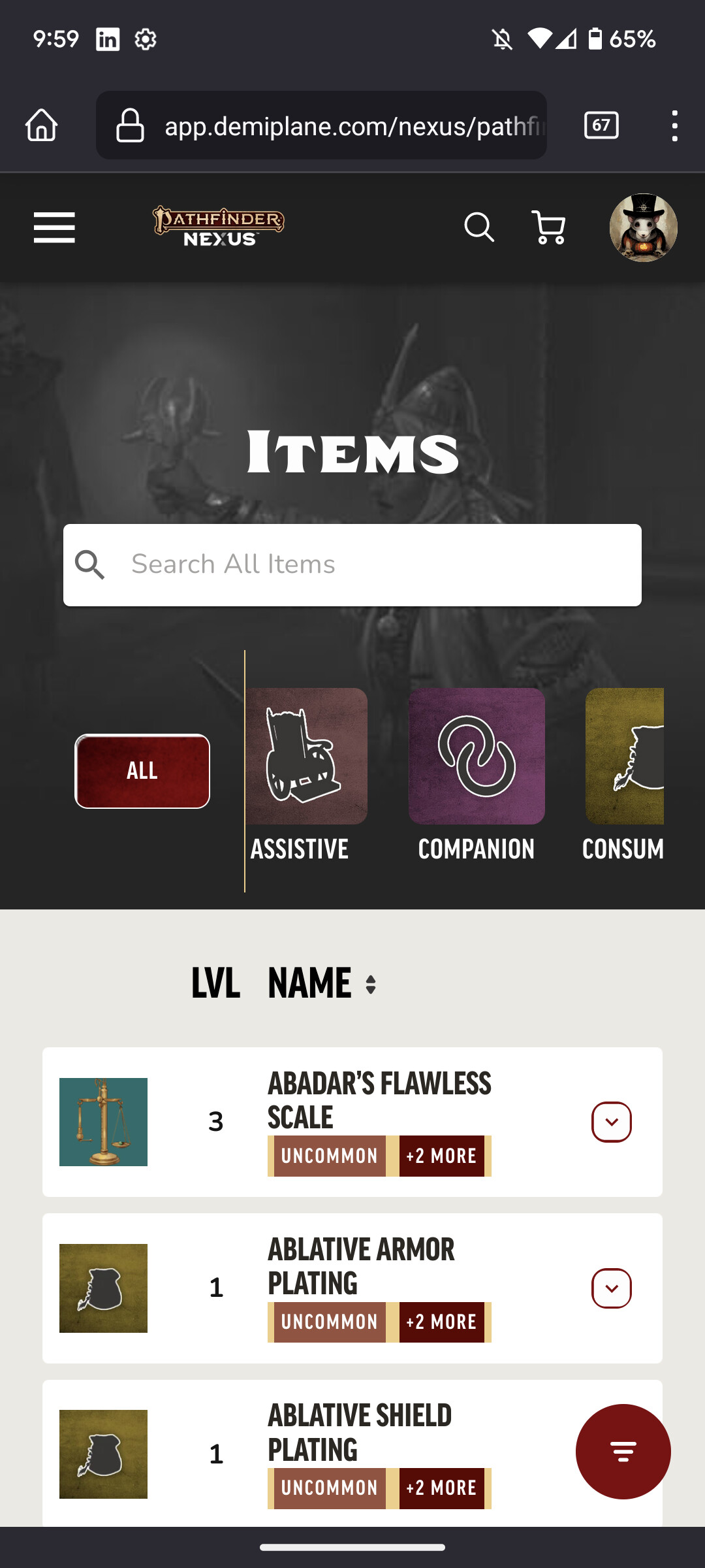
Why are the margins between Visual Elements so big? I.E. There’s significant white space between the “Items” header and the Menu Bar.
The horizontal scroll bar for Item Selection is not very usable either. There’s two item categories shown at a time out of 30. I think it would be a lot better if I could see at least 6 or 7 choices at a time, or was a pop up menu kinda like how the DnD beyond App uses
(Removed due to Embed limit)
(Also notice how much smaller the text and margins are there)
The same “only two at a time” also applies to the stages of the items. If I can only read two at most it’s not very useful. Maybe add additional lines for more tags? Or have the “expand button” top aligned so the tags can go the very end of the item box ?
Also it’s broke on expanded view too
(Removed due to Embed limit)
A small final note for this screen is I would consider getting rid of the margins around the image so you can expand it the entire way. You have all this beautiful artwork and I really want to see that. Maybe even have the image as a really transparent overlay behind the text.
–
Hamburger Screen
(Removed due to Embed limit)
All of these options are way too large. Why is everything so big? These all can be a lot smaller.
My second suggestion would be to remove merge the Demiplane Back Button and the Nexus Selection into one row that’s not under a drop down. Have four squares, with the left most being the Demiplane logo (your back button) and the other 3 being the most used Nexuses like the drop down already shows.
This will eliminate a row and make quick jumping easier.
Since I don’t like being a negative Nancy and I’m aware that UI work is extremely hard, I like that when you open the hamburger menu it both fades in and expands very fast. The entire site is very responsive in fact.