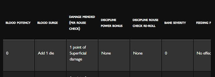
The Revised Blood Potency Table from the Player’s Guide isn’t displaying properly and is getting cut off on the right side.
Yeah, that table is a little unwieldy. There is a scrollbar at the bottom of the table, which you can use to scroll right and see the cut-off text, but that’s definitely not ideal given the size of this table.
We’ll take a look and see if there’s anything we can do about it. ![]()
You could probably tighten it up by putting each word on a separate line on some of the column titles. For example, instead of:
BLOOD POTENCY
use
BLOOD
POTENCY
Do the same for ‘BANE SEVERITY’. This will work well since the data in those two columns are only a single digit. This should condense the entire table enough to eliminate having to use a scroll bar.
