The talent trees should really look more like this:
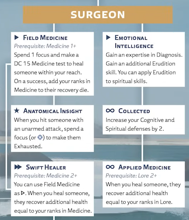
How it’s implemented now is so much more cumbersome than the page spread we have been shown.
For one thing, the position of the prerequisites right now is inconsistent, sometimes they’re on the top of the text box, sometimes they are on the bottom, sometimes the box will go up the window and remain unreadable if you don’t scroll up, other times the text box is too big and you will have to “click to see more” to look at the prerequisites at the bottom.
When making or advancing PCs, it has you hovering and clicking all over the place to see what you should use your skill points on and what talents you can gain access to, which remain hidden in the character creation and advancement process if you don’t cover their prerequisites with your character sheet.
I think it’s something worth implementing in the final product, even the short text for the abilities is a huge quality of life improvement for looking through your options without opening hovering boxes and sidebars.