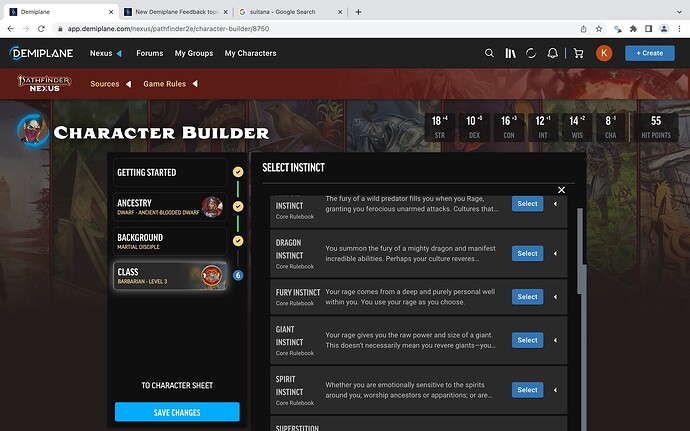
Three things stand out when selecting options from a sub-menu:
- Sub-menus have a scroll bar that appears on the right/outside of the overall selection menu. As a user, I was expecting the scroll bar to be on the left/inside of the overall menu since it is a sub-menu (within the menu). This led to me to wondering if the menus were loading properly.
- Sub-menus don’t have any bottom padding. It’s unclear to me if I have truly reached the bottom of a sub-menu. The parent class menu has bottom padding, and is much more clear.
- Some sub-menus don’t fully scroll to the bottom, like this example with Barbarian Instincts. I haven’t purchased the APG; this could be related.
Suggestions
- Place sub-menu scroll bars within the window of the selection pane.
- Add padding between menu and sub-menu scroll bars. Maybe darken the main class scroll bar to indicate when the sub-menu pane is active.
- Add bottom padding to sub-menus to highlight the bottom of a sub-menu.
- Identify bug causing cutoff on barbarian instincts.
Thanks for all of your hard work!
