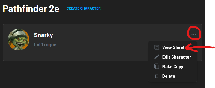
When at the ‘My Characters’ selection screen, if you click on a character it default takes you to the builder again. Clicking on the three dots to access View Sheet isn’t that intuitive.
I would suggest making the default of clicking the character to open the Character Sheet and keep the editor within the drop down menu hidden behind the three dots.
I would also include the option to purchase starting items with gold in the beginning section of character creation.