Preface: As a professional dev myself, I know that a long list of improvements can feel disheartening, so I want to make clear right now that I quite like the tools! They look great and far exceed my expectations.
Overall design
- Visually, I love the design. Character sheets are often very boring to look at, but these are fantastic, and the wizard itself looks nice. I’ve also always loved the use of Cormorant.
- I felt a little lost when I first looked at the wizard. Entering my character’s name and age was given less prominence than other sections.
- I’m happy there’s a button to skip the wizard, but “character sheet” is somewhat confusingly named. Maybe this could be made clearer?
Wizard
- Would be nice to be able to drag a character portrait image into the window rather than having to click select and go through the system dialog
- On selecting a clan, it would be nice if the “attributes & skills” button would enable. Clicking it would be the same as clicking “select ” and then clicking “attributes & skills” (save a button click).
- Clicking one of the disciplines in the clan pane takes me to a new page, and I have to use browser back. I think this should either open a new window or (even better) open a popover.
- The trait selection process works but feels a bit clunky. Every interaction feels like it needs one more click than I’d like. It might be nice if selecting the last item in a “placement” would automatically move to the next set.
- The page could be made more ergonomic if the trait “SELECT” buttons were on the left side of the traits rather than the right (less mouse movement).
- When selecting Hecata, there is no apparent way for me to specify a “Shifts in the Blood” discipline swap (e.g. Auspex → Potence).
- It might be better to select your PT before disciplines, so you don’t select powers, select PT discipline, then select a power again?
- Advantages: It wasn’t immediately clear to me I should click “merits”, “backgrounds”, or “flaws”.
- It’s possible to select mutually exclusive merits and flaws, such as Stunning and Ugly.
- Flaws are listed under their parent name, e.g. “Herd” instead of “Obvious Predator”.
- Nowhere to specify what a folkloric bane/block is
- Convictions and touchstones should probably be put into 3 separate pairings rather than one field for all convictions and one for all touchstones.
- Coterie merits/flaws are just text fields instead of selectors like the rest of chargen.
- Because I couldn’t select a “Shifts in the Blood” discipline earlier, I have to purchase Potence at out-of-clan rates.
- Newly created vampires should start at 1 Hunger, not 0.
Character sheet screen
- As before, I love how this looks. Chef’s kiss.
- Freely creating a character sheet (i.e. without using the wizard) is very clunky.
- The red numbers (e.g. “Athletics 2”) are very thin and hard to read due to the red in use. Perhaps they could be made bold?
- Same as above for the (S) specialty indicator.
- “CLAN AGE PREDATOR TYPE” reads strangely (e.g. Hecata Neonate Graverobber). I think “AGE CLAN PREDATOR TYPE” reads nicer (“Neonate Hecata Graverobber”).
- Clicking to apply tracker damage is noticeably slow and results in a flicker across all other trackers and certain other page elements.
- It’s odd to be able to mark damage on arbitrary tracker boxes.
- There doesn’t seem to be a way to enter degeneration by applying more stains than you have empty boxes.
- Failing a Rouse check should increase Hunger. Clicking “re-roll” and passing should remove that Hunger gained.
Dice rolls
- Link targets to add a trait to rolls are very small for skills. It’s unclear that they’re targets at all unless you mouse over them and see the cursor change.
- Link targets for “info” are much larger than link targets to create rolls, which feels backward from the most common use.
- The roll pane should stand out more from the rest of the page, IMO.
- How do I add specialties to a roll? Modifiers? Blood surge?
- How do I specify the difficulty, which matters for determining a bestial failure?
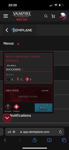
- The number of successes should be much more prominent.
- There should be an indicator if you have a critical success.
- I appreciate that you can click a Discipline dice pool and auto-populate the roller.
- Clicking the pool multiple times allows you to add infinitely many duplicates of the pool.
- I appreciate that BP bonus is automatically applied.
- Ceremonies are missing a dice pool.
- Rolling a discipline that has a rouse check should automatically perform a rouse check.
- After doing 50 rouse checks, I never saw an indicator that I hit a 1, which is important information if using Oblivion. (Possible I was just bamboozled by RNG and never actually rolled a 1, but it’s statistically very unlikely.)


